Case Study: A Website Redesign for Foundations Wellness Center
All companies, big or small, have to keep up with the constant web changes if they want a strong online presence. Just look at how often big websites change their site design or security features! (Of course, security updates are more frequent than a whole website redesign, to be fair.)
No matter what your company does or how many employees you have, it’s important to revitalize your website, social media, or app from time to time.
With so many people using Google to search for products and services, you always hope that your website or social media is the first thing they see. But, as everyone knows, those first impressions are critical, so having a confusing or outdated website or social media presence could actually cost you, in the form of lost revenue.
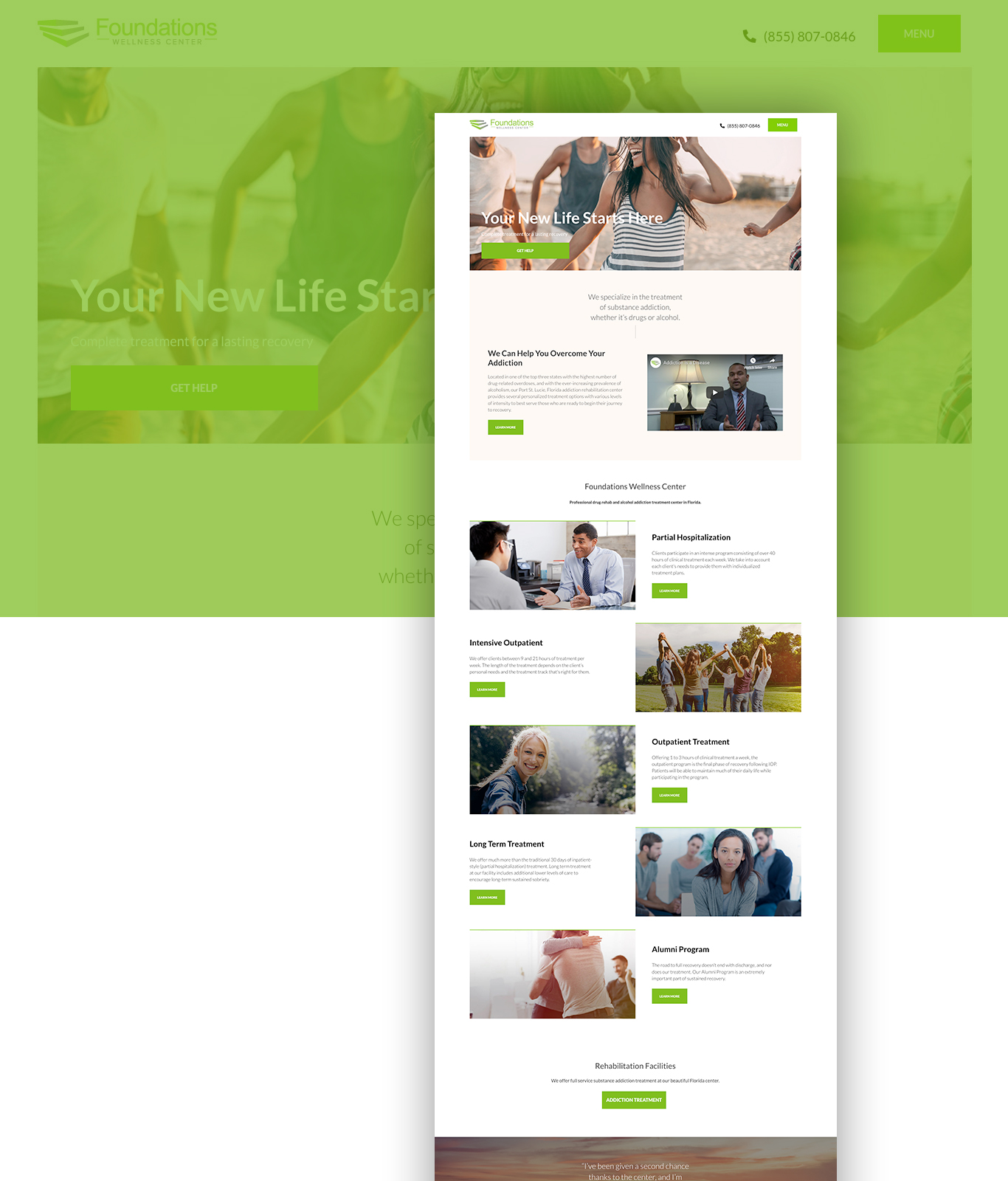
Recently, Foundations Wellness Center, an addiction treatment and trauma rehabilitation center located in Port St. Lucie, FL, were compelled to make some positive changes, so they hired us to do a complete assessment, redesign and redevelopment of their comprehensive website.
They had a consistent stream of visitors, but they felt that they could really step it up and help more clients by having a fresher, more current website design. The new website would need to deliver an improved user experience, with excellent mobile capabilities, and lay out and explain their many services in a better way.
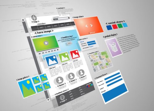
A Medium-Sized Website in the Making
Foundations Wellness Center provides a variety of addiction treatment, counseling, mental health and wellness services. Their website needed enough pages to accommodate those services. A medium-sized website, which has somewhere around 20 pages, was just the right fit. By contrast, a small website has up to 10 individual pages and could not have contained the wealth of information they needed to get out.
A medium-sized website is also slightly more complex in structure and layout, as one might expect. It has two tiers of navigation, and subpages run under the main pages, such as Services, Programs, or Blog. This helps organize the information in a logical way and makes it easy to navigate the overall site structure.
Our Website Redesign Approach

We had several recommendations for the Foundations Wellness Center website redesign and development. We suggested, as we always do, a mobile-first, client-centric approach. That means that a prospective client should be able to easily navigate the website (and any other elements of marketing,). And, more than ever, that will most likely happen on a handheld device, such as a smartphone or tablet.
More importantly, the site needed to connect on a personal level. It needed to speak to them, recognize their pain points and the worthwhile journey to come, address their fears and concerns, inspire hope and confidence for success, as well as offer a clear path to action.
We recommended and implemented the following, with the goal of making their website more client-centric:
- Intro. They had an aerial drone-shot of the facility that, while it looks nice, it didn’t really speak to their clients. We suggested moving the video to the About page or the Contact page – or remove it altogether.
- Icons. They used very generic icons that were hard to relate to, such as “missing headshot” icons. We suggested replacing them with more relatable icons or to simply remove them.
- Services. They needed a “Read More” link or button that would increase the usability for those who can’t easily figure out to click on the headline or photo.
- Reviews. It’s important to show one or more reviews on each page, as they’re very beneficial for gaining trust and conversions. Satisfied clients’ words definitely weigh more than anything they could script.
- Language. The focus of the message needed to change from “we/us” to “you”. For example, instead of “Get in Touch”, which is generic and lacks purpose, a better call to action was “Get Help”.
- Improved word count. The website needed more text in most of its pages. A minimum of 700 words per page would be necessary to make Google pay attention to those pages as relevant search results.
- Blog. The main blog page needed a sidebar that could display categories, an archive, most popular posts, as well as a search box.
- FAQs. Adding an FAQ library is a great way to both answer patients’ questions and to make the facility more prominent in searches.
Furthermore, we kept the website in WordPress, which allows for easy tweaks, updates, and self-maintenance in the future. In WordPress, it’s very easy to add new pages, blog content, and security or workflow features.
By the end of the website redesign and development, the Foundations website included these pages:
- Homepage
- About Us
- Team
- Our Location
- Treatment (describes all treatment options)
- 4 Treatment subpages, one for each of the 4 treatment options
- Programs (describes all treatment programs)
- 5 Program subpages, one for each of the 5 programs
- Blog
- FAQ Section
- Contact
A Website for the Modern Times
Overall, the website redesign is not just beautiful and modern (in our modest opinion!). It is also up to date with current standards in web technology and in search engine optimization (SEO). The layout is responsive, which means that it easily adapts on all device screens.
But, don’t just take our word for it. Take a look at the website and browse through the content pages. See for yourself how even a website that deals with such a serious subject as addiction and trauma treatment can be interesting to browse and visually captivating.
![The Ultimate Small Business Digital Marketing Guide [2024]](https://brightpinkagency.com/wp-content/uploads/2016/11/digital-marketing-standards-2017.jpg)