 Skip to content Skip to content
 Do you know why some websites are more successful than others? It’s not just about content or services – it’s about how well they follow key web design principles. A well-structured, visually appealing, and user-friendly website can improve SEO rankings, boost engagement, and increase conversions. In this blog, we’ll explore 9 fundamental web design principles that every business should apply.
Visual Hierarchy in Web Design Principles
Visual hierarchy means highlighting the elements (text, image, etc.) you want visitors to see first. There are many ways to achieve that:
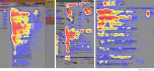
- Page-scanning pattern – most users follow an F-pattern when reading a web page. Use this tendency to your advantage. Put the most important information near the top left corner of a page and place headings on the left.
- Size – the bigger the element, the more attention it gets.
- Color and contrast – images or text with bright and bold colors draw more attention. On the rest of your website, however, use your brand colors – ideally those in your logo, which shouldn’t be more than 2-3. This is one of the web design principles that you can easily apply to improve conversion: use the boldest colors only where you want to draw the most attention (calls-to-action, for instance).
- When we redesigned the website of this Coral Springs family dentistry, we reserved the accent color for calls-to-action and kept the rest of the palette in the blue range of their brand colors.
- Typeface – using heavy and stylized typefaces can help highlight certain phrases or headings. However, don’t use too many typefaces on your website (2-3 should do). Assign fonts to headers and use them consistently across your website.
- Headings and subheadings are commonly used to organize the text and create a visual hierarchy.
- Directionality – text that’s arranged non-horizontally draws immediate attention.
- Space and texture – adding more space around certain elements help distinguish them from the rest.
White Space: A Key Web Design Principle for Readability
White space is the spare area around web page elements that helps eliminate clutter, highlighting important elements on that web page. A simpler layout and design make your content more digestible and help increase your conversion rate. How you use white space also reflects your business values. For example, a lot of white space suggests luxury and minimalism. Less white space usually denotes the informative quality, like news websites.
The Grid System
The grid system provides a visual structure for neatly organizing content on a web page. Web designers typically use a grid with multiple columns to display content.
Occam’s Razor
Occam’s Razor is a principle from philosophy stating that, between two explanations, the simpler one is usually better. Occam’s Razor is also a web design principle because the simpler design is almost always superior. So when you’re thinking of removing content from a long landing page, you’re most likely right.
Accessibility in Web Design: A Must-Have Principle
Accessibility in web design refers to making your website accessible to all users, including those with disabilities and other special needs. To do so, choose popular fonts such as Open Sans at a comfortable size. Also, use contrasting colors for legibility, like black text on a white background. Be careful of your website’s appearance on mobile devices – you’ll need to invest in responsive web design.

The Golden Ratio: A Timeless Web Design Principle
The Golden Ratio is a mathematical ratio found in nature and has been used by many artists and architects since ancient times. The ratio, 1.618, helps designers create pleasing and natural-looking compositions. For example, dividing the typical width of a webpage (960 pixels) by 1.618 results in 594 pixels. You’ll find that page height on many websites.
Gestalt Design Laws: Enhancing UX in Web Design
Gestalt Design Laws refer to how the mind copes with visual input. Here’s how the laws apply to web design:
- Proximity – We tend to see objects that are close in space as one object.
- Similarity – If a number of items look similar, we perceive them to be in the same group.
- Continuity – When the eye starts following something, it’ll continue traveling in that direction. For example, you have a photo on a landing page of a person looking toward your call to action.
- Closure – When we see shapes or images that aren’t complete, we tend to fill in the blanks. You can use this principle to create interesting graphics.
- Common fate – Our mind groups together objects that show the same directionality. We perceive people gesturing in the same direction as a group.
- Symmetry – Our mind likes symmetry and coherent shapes. So when we see two unconnected but symmetrical elements, we tend to put them together.
Hick’s Law: Simplifying Choices in Web Design for Better UX
Hick’s Law is a web design principle that refers to the Paradox of Choice. When you give people too many choices, most of them won’t choose anything at all. In terms of web design, Hick’s Law is about minimizing the number of choices, such as calls to action, you give to your visitors to improve conversion rates.
Fitt’s Law: Improving Clickability in Web Design Principles
Fitt’s Law refers to putting important target objects, such as a submit button, a hyperlink, or an input field, in the most accessible area of a web page. The quicker visitors can reach a target object, the more convenient and easy it is to use.
Web Design Principles Conclusion
Knowing these web design principles can help you understand what works best for your website. Next time you hire a web design agency (such as Bright Pink Agency), you’ll be able to understand better why they did what they did.
Do you think it may be time for a change? See when your site might need a redesign. And don’t forget to key questions before hiring a web designer.
Give us a call if you want to learn more about how we can help you design the best site for your business (even if it’s a franchise!).