 Skip to content Skip to content

The web is dominated by minimalistic websites emphasizing readability and accessibility. Having a site that follows basic website readability and usability standards is important. Many businesses advertise or invest in content marketing. However, some users who land on their site leave because they don’t understand what you’re trying to sell them.
This article will teach you how to improve website readability and accessibility. Let’s get started.
Website Readability Best Practices
Here’s what you can do to improve the readability of your website right now.
Make your text easy to read
As noted, text clarity is key. Your visitors will navigate away from landing pages if they are confused about your message or cannot read your content.
Use readable, web-friendly fonts, and make them large enough for users on all devices.
- Contrast is important — black on white text is easier to read than white on black. Whatever combos you use on your site, ensure they are complementary colors that allow for sufficient contrast.
- Font spacing, always overlooked, should be large enough to create reading ease, especially when large chunks of text are involved.
- Device compatibility — your site should be accessible across all devices, meaning the design should be responsive.
- Make it engaging — whether it’s content on your homepage or other selling pages, or just blog posts, make it engaging. Use subheadings to signal content intent and bullets and images to make blocks of text less dull.
- Whitespace — have plenty of unused space on every page. A crowded page will not lead to better conversion, just to more confusion.
- Site speed — Keep an eye on general loading times. Speed greatly improves site usability, and slow websites will frustrate visitors.

Use relevant headings and calls to action
Guide your visitors through your site with relevant text that will show them what they are clicking on, what page they are on, and how they can navigate away from that page.
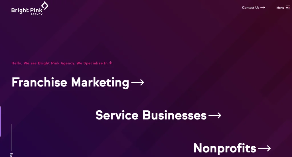
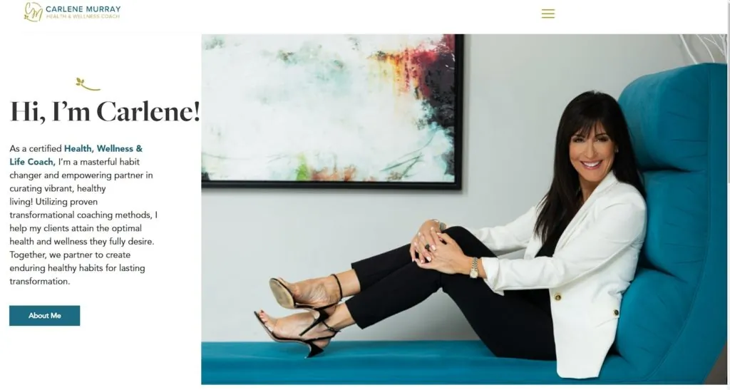
The first heading they will come in contact with when landing on the site is on the homepage, preferably above the fold. Use that to explain your business and unique selling proposition, aka mission.
Below is a screenshot of our homepage when you land on it. You can understand that we are a design agency that does franchise marketing and works with service businesses and nonprofits.
Make your images count
Images play a pivotal role in enhancing your website’s readability and user engagement. By incorporating high-quality, relevant images, you can effectively break up text, illustrate concepts, and draw attention to key messages. Ensure that your images are optimized for web performance by compressing file sizes and using appropriate formats to maintain fast loading times.
Additionally, include descriptive alt text for each image to improve accessibility and SEO. Captions can provide context and further explain how the images relate to your content. Thoughtfully placed and well-optimized images not only make your website more visually appealing but also contribute to a better user experience.
Intuitive navigation
While some designers will integrate experimental navigation into sites, that is not the most successful way to make your site easily accessible. Use classic patterns to increase the site pages’ learnability, including having main items visible in header navigation and subitems included in dropdowns.
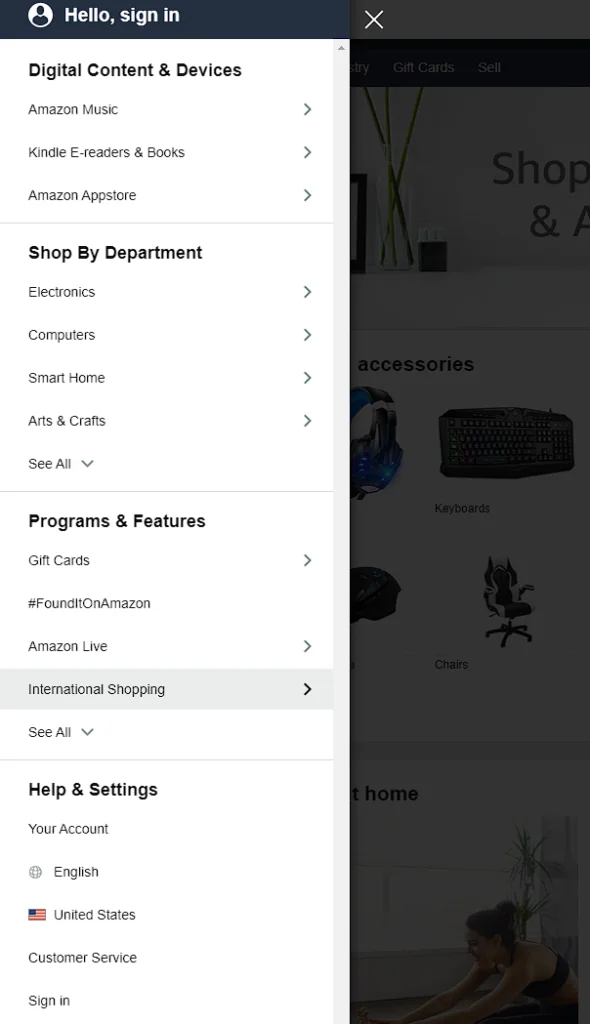
If you have a more complex structure than that, another way to do it is to include side navigation for category pages. This is how Amazon deals with having a lot of items. They divide them into categories on a large sidebar:
Also, don’t forget about the “back” buttons. Make it easy for users to navigate away from their page and return to the homepage or the main category page.
Hypertext will point out links in context, but make sure you are highlighting it and changing the color to make it stand out. Here’s an example from Semrush:
Use modern design to stand out
Using a “modern” design doesn’t mean you shouldn’t try to stand out with layout manipulations, images, colors, and content. However, standing out with a 1992-looking website is not the answer.
Your readers have used the web before, and they will unconsciously compare your website design. Keep your general layout in line with trends to create the appearance of a business that is cutting-edge in all it does.
Here are a few web design trends to keep in mind.
Large hero images
Large hero images are prominent, high-quality visuals displayed at the top of a webpage, often spanning the full width of the screen. They serve as an immediate focal point, capturing visitors’ attention and conveying your brand’s message or value proposition within seconds. By using compelling imagery that resonates with your target audience, you create an emotional connection that encourages users to explore your site further.
To maximize the impact of hero images, ensure they are relevant to your content and optimized for fast loading to maintain site speed. Incorporate concise, powerful text overlays or calls to action to guide visitors toward desired outcomes. Additionally, make sure your hero images are responsive so they display correctly on all devices, providing a consistent and engaging user experience across desktops, tablets, and mobile phones.
Tile or card design
Tile or card design is a popular web design technique that presents content in neatly organized, visually appealing blocks known as tiles or cards. Each card typically contains a concise piece of information—such as an image, title, brief description, and a call-to-action—that collectively represent a larger set of content like products, blog posts, or service categories.
This layout allows users to quickly scan and digest multiple offerings without feeling overwhelmed, enhancing user engagement and making navigation more intuitive.
One of the key advantages of tile or card design is its responsiveness across different devices. Whether viewed on a desktop, tablet, or smartphone, the card-based layout adjusts seamlessly, stacking or rearranging cards to fit the screen size without compromising the aesthetic or functionality.
Additionally, this design often incorporates interactive elements like hover effects or animations, which can further engage users by providing immediate visual feedback and encouraging them to explore content more deeply.
Hover animations
Hover animations are subtle yet impactful design elements that enhance user interaction on your website. These micro-interactions occur when a user places their cursor over a specific element—like a button, image, or link—and triggers a visual response such as a color change, movement, or the display of additional information.
By providing immediate feedback, hover animations make your site feel more dynamic and intuitive, guiding users’ attention and encouraging them to engage more deeply with your content.
To effectively implement hover animations, ensure they serve a clear purpose and improve the user experience without causing confusion. Use them to highlight interactive elements or reveal supplementary details, but maintain consistency so users can predict the outcome of their actions.
It’s crucial that the design clearly indicates whether clicking an element will navigate away from the current page or perform a specific function. Thoughtfully designed hover effects can make your website more engaging and help users understand how to interact with various components seamlessly.
Keep testing
Continuous testing is essential for maintaining and enhancing website readability, usability, and overall performance. By regularly evaluating how users interact with your site, you can identify what works well and what needs improvement.
Implementing A/B testing allows you to compare different versions of your webpages to see which designs, layouts, or content pieces yield better engagement and conversion rates. This data-driven approach helps you make informed decisions about adapting your site to various devices, rearranging content for clarity, or adding new features that enhance user experience.
Moreover, frequent updates and refinements signal to search engines that your website is active and relevant, potentially boosting your search rankings. Regularly adding fresh content, updating existing pages, and removing outdated or underperforming material keep your site relevant and valuable to visitors.
By continuously testing and optimizing, you ensure your website remains up-to-date, clear, and concise—effectively serving as a dynamic window to the digital world that meets the evolving needs of your audience.
Still not sure how to improve your website readability? Contact Bright Pink Agency!
Website design and development (which includes website readability) is a complicated endeavor that must be taken seriously if you want your business to thrive. Each business must have a unique website that caters to its audience and shows its services or products in the best light possible There are plenty of design options for everyone. Contact us to discuss your website needs and expectations.