 Skip to content Skip to content

When it comes to franchise web design mistakes, brands walk a fine line. A franchise website has to serve both the corporate brand and every local location. Too much control at the corporate level and local pages feel lifeless. Too much freedom for Franchise Owners and suddenly you’ve got a rainbow of off-brand sites competing with each other on Google. Either way, what should build brand strength ends up chipping away at it.
We’ve built franchise websites for brands with anywhere from 10 to 500+ locations. We’ve seen the full spectrum — from systems where franchise owners can’t even update their store hours, to ones where they’ve launched DIY sites that look nothing like the corporate brand. In both cases, one small design flaw doesn’t just stay local. It ripples across the system, hurting usability, search performance, and brand trust at scale.
The good news? Most franchise web design mistakes are easy to spot (and fix) once you know what to look for. Here are the most common pitfalls in website design for franchises—plus the best practices to help your digital presence work harder for both your brand and your franchisees.
Mistake 1: Flat, Templated Design with No Spark
Cookie-cutter templates make your franchise look generic, like it was baked in 2009 and left on the shelf. Consistency matters, but the best franchise websites leave room for individuality, giving brand personality space to shine without flattening into sameness.
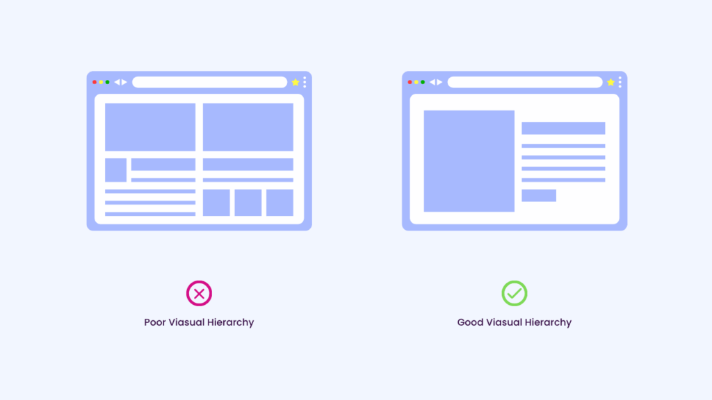
Mistake 2: Busy Layouts with No Clear Hierarchy
If everything screams for attention, users miss what matters most. Smart website design for franchises uses clear hierarchy, whitespace, and typography to guide customers toward key actions like scheduling, calling, or finding a location. But hierarchy isn’t just about layout — readability matters too. Long blocks of text, tiny fonts, or poor contrast make content overwhelming. When multiplied across dozens of franchise sites, cluttered copy and low readability can turn what should be a user-friendly brand into a frustrating one.
Mistake 3: Treating Mobile as an Afterthought
Most customers are searching on the go — in the school pick-up line, standing in a flooded basement, or waiting on their latte. If your site isn’t thumb-friendly, you’ve already lost them before the coffee’s ready.
That doesn’t mean every franchise brand should only design for mobile. The real mistake is ignoring where your traffic comes from. For service-based franchises, mobile-first design is critical because that’s where customers are searching. For industries with more desktop-heavy users, the key is responsive design that prioritizes the devices your audience actually uses. Either way, a clunky mobile site is a dealbreaker, and a design mistake no franchise can afford.
Bright Insight: Google’s Core Web Vitals are a great benchmark for measuring mobile performance and user experience.
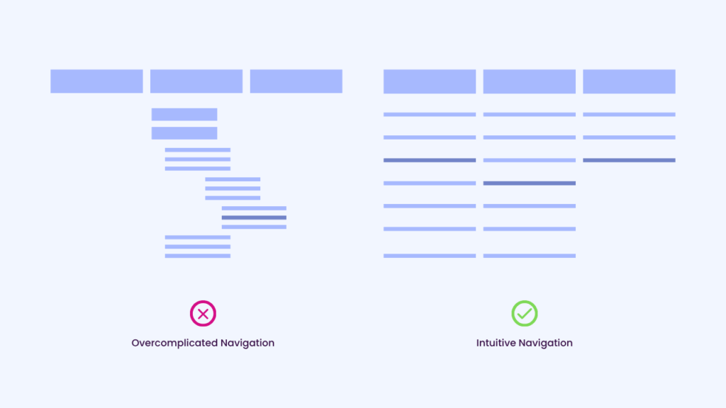
Mistake 4: Overcomplicated Navigation
Endless dropdowns and confusing labels frustrate users. In franchise web design, this problem gets amplified because you’re not just listing services — you’re balancing corporate-level categories with location-specific offerings. The best franchise websites keep navigation intuitive, so users can find what they need in two clicks or less.
Bright Insight: Take 4Ever Young’s website as an example. With dozens of treatments, their dropdowns could easily become overwhelming. Instead, services are grouped into clear categories like Wrinkles & Fine Lines, Facial Volume, and Acne & Acne Scarring, with corresponding treatments neatly listed. It’s a simple way to present a large menu without creating “navigation fatigue.”
Mistake 5: Buried Franchise Location Information
For franchises, location visibility isn’t just nice to have — it’s the backbone of usability. If a customer can’t quickly figure out which location serves them, they’ll bounce and find a competitor who makes it easy.
Too many franchise websites bury the “Find a Location” tool in a footer or hide it behind multiple clicks. Even worse, some systems don’t provide a true locator at all, forcing customers to hunt through pages or guess which office is closest.
Fix: Make your office locator a main navigation item, visible on every page. And don’t stop there:
- Ensure the locator uses a working map feature (not just a text list).
- Allow users to search by zip code, city, or even with geo-location. (with permission of course…)
- Clearly link every result to a dedicated local page with NAP details (name, address, phone, hours).
Bright Insight: Take PuroClean’s office locator as an example. It’s intuitive, search-friendly, and map-driven, making it effortless for customers to connect with the right local franchise location. Bonus: this structure also signals clear local relevance to Google, improving local SEO visibility system-wide.
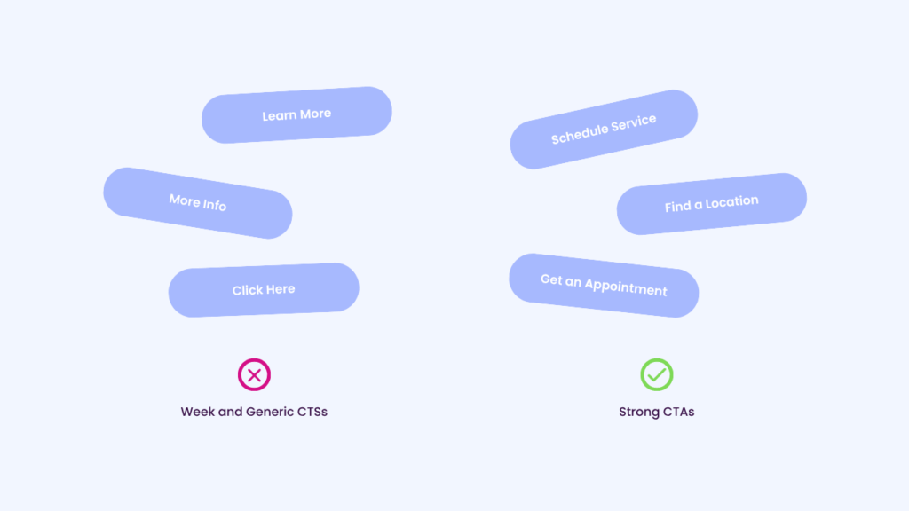
Mistake 6: Weak or Hidden Calls to Action
Strong franchise website design means making the next step obvious. Whether it’s “Schedule Service,” “Find a Location,” or “Call Now,” CTAs should be clear, prominent, and limited to avoid confusion.
Choose one designated CTA color that’s distinct from your brand palette but still on-brand. Use it consistently for all primary actions across the corporate site and local pages so users instantly know where to click. Pair this with action-driven text like Get Help Now or Schedule My Free Estimate.
Mistake 7: Pop-Ups That Frustrate Users
Intrusive pop-ups are the digital equivalent of a mall kiosk worker chasing you with hand lotion. Wrong time, wrong place. Use intent-based banners or timed offers instead of blocking the first impression. In franchise web design, user experience comes first.
Mistake 8: Ignoring Accessibility
Low contrast text, tiny fonts, missing alt text, or broken keyboard navigation aren’t just poor usability—they’re legal risks. Accessible franchise websites show care for all users and strengthen the brand’s reputation.
To see the gold standard, check out the W3C Web Accessibility Initiative. These guidelines aren’t just best practice — they future-proof your site for compliance and inclusivity.

Mistake 9: Over-reliance on Stock Photography
Generic stock photos scream “we’re not real” — and they erode trust. Customers can spot the overly-happy headset lady or the perfectly staged boardroom a mile away. What actually builds confidence are the real faces and real places behind your franchise. Authentic photos of your locations, staff, and customers create credibility and make your website feel truly local.
Bright Insight: The new PuroClean website is a great example of how to do this well. Instead of filling pages with stock images, they invested in branded photography — technicians in correct uniforms, using PuroClean-branded equipment, working in real environments. It feels professional, but also authentic, showing customers exactly who will show up when they call. That combination of consistency + reality builds more trust than a library of generic stock shots ever could.
For franchises, this isn’t just about trust — it’s about scalability. One branded photoshoot at the corporate level can fuel hundreds of consistent, authentic local websites.
Bonus Local-Level Mistakes
Mistake #10: Hidden Key Details
Basic information like hours, phone, and address should always appear above the fold.
Bright Insight: 4Ever Young’s Boca Raton page puts address, phone, and hours front and center. This boosts both user trust and local search rankings.
Mistake #11: No Local Content
Highlighting community involvement, events, or real storefronts brings authenticity to local franchise websites. When every location looks identical, customers miss the local connection that builds trust.
Not every Franchise Owner has enough material for a full “Community” page, but that’s okay. A scalable solution is a toggled block on the local “About Us” page where local owners can showcase involvement when content exists.
Mistake #12: Inconsistent Branding Across Locations
Random colors and layouts confuse users and weaken corporate branding. Franchise website design must balance consistency with local flexibility.
Mistake #13: Neglecting Reviews & Social Proof
Customer testimonials and Google reviews aren’t just nice-to-have extras — they’re powerful trust signals. Today, reviews are the new word of mouth: searchable, scalable, and impossible to ignore. Showcasing authentic local experiences turns hesitation into confidence. And for franchises, the impact is doubled — reviews not only build customer trust, they also strengthen local SEO when connected to Google Business Profiles.
Bright Insight: ohDEER’s Montgomery County location is a great example — they display 5-star Google ratings right at the bottom of the hero section. The gold stars overlap the hero image, so trust is established before the visitor even scrolls. That subtle design choice makes social proof part of the first impression and sets the tone for the rest of the site.
Avoiding Franchise Web Design Mistakes to Protect Your Brand
Strong website design for franchises isn’t about flashy tricks — it’s about clarity, consistency, and authenticity. Think less “Vegas light show,” more “airport runway lights” — clear, direct, and built to guide people exactly where they need to go. Avoiding these common franchise web design mistakes helps your brand create a digital experience that supports every location and meets customers where they are.
If your brand’s franchise website feels more “cookie-cutter” than a conversion engine, we can help. Our BrightStart Website Strategy is a deep-dive audit and strategic roadmap that shows you exactly how to fix franchise web design mistakes and improve your website design for franchises — even if you’re not ready for a full redesign.