After providing web design and development services for eight years now, we know how many things you need to juggle to get your website just right. It all starts with picking a domain name, choosing the right design and development platform for your business and making sure the site is fit to turn up in search results. While it sounds easy, you have to make sure that all these moving parts are in the right place.
The goal of your site and how you will earn money from it
1. Define what the goal of your site is. How will you convert?
Is your website a blog, a presentation page, is the goal selling products on your page – these are some of the questions you need to ask beforehand. Your choice will reflect in the content management system you will go with, the design and the structure of the site.
Whatever type of site you are going with, your goal is getting conversions. You need to set out on attaining said goal, which translates conversions into how many visitors buy your products, subscribe for your mailing list, read you article and so on.
Understanding this one small point is the difference between a successful website and a failed one. Depending on the type of business you are in, this translates into every aspect of your process, starting with the domain.
2. Monetization
Keeping in line with my previous point about knowing what you want from your users, set out to build a site with a specific monetization goal. This means you can earn with your site from direct traffic via Adsense, Taboola, media.net etc or sell products to consumers on an e-commerce site. Other options include selling services, classes after building up a mail list or creating a site for brand awareness, which would require email capture.
Choosing a domain name and TLD
3. Choose a domain name
I want to emphasize that your actual domain name is totally up to you, but your TLD (top level domain) can make or break you. Google favors .com TLDs, which stand for “commercial” in non-local search results. .net (network) and co (company) are other popular generic domain names that signal a commercial intent for your site.
4. Clarify intent in your domain name by opting with either generic or country specific
If you mostly do business locally and are not living in the US, then a country code top-level domain (ccTLD) will be favored in search results. That means going with .fr if you live in France, for example. If .paris is available to you, I would still go with .fr in this case, as this would be Google’s go-to technique when performing geo-targeting on your site.
5. What if I have a startup?
In recent years, app developers have been favoring the use of the .io extension over .com, basically geotargeting their site with the Indian Ocean mark.
That’s cool with Google, as .io has been accepted as a generic TLD (gTLD). Last year, the people at Google have issued a statement mentioning that all generics are treated equally when it turns to ranking on their results page.
A complete list of gTLDs can be found here, but you will notice that stuff like .investment and .insurance is on that list, and choosing one of these TLDs could send out a spam alert to your users and lower your click through rate.
6. Don’t use exact match domains
EMDs or exact match domains are names that are made out of the keywords you want to rank with. While this is a long standing SEO technique, webmasters using this practice are now being penalized by Google for this and their rankings are dropping.
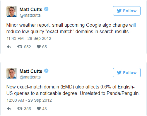
Using an EMD used to be a quick fix for instant high rankings, but even before the new Google algorithm rolled out, it was only affecting your search by about 7%, according to Neil Patel.

The right CMS for you
7. Choose a content management system
Whatever you do, always go with a CMS (content management system). The CMS will not affect your design, as you can tailor any design to fit your chosen platform. It only supplies the framework that will allow you to change around data on your site with little or no technical knowledge.
When selecting a CMS, be sure that it is updated regularly and has a number of plugins to help your work. According to W3techs, the leaders in CMS usage worldwide are WordPress, Drupal, Joomla and Magento.

As you can see, most smaller businesses go with WordPress, mainly because the user interface is friendly and easy to use. Plugins are also affordable and, perhaps most importantly, due to the popularity of WordPress you will find more experts in developing on the platform.
8. How about the right CMS for eCommerce?
WordPress allows the usage of the most popular eCommerce plugin, WooCommerce. The main benefit of this is that it doesn’t have large server requirements, it is user friendly and there is a large community out there that you can rely on when seeking tutorials, tips etc.
I will only talk about WordPress and Magento here, as, although in fourth position, Magento is very popular with eCommerce site owners. Just look at this chart from Builtwith.com:

Magento will prove very useful to larger store or store owners planning to scale, as it is highly customizable and allows a number of extensions. However, it does require more server space and will be more difficult to use.
Pick good hosting
9. Hosting – identifying your needs
Picking hosting should be based on your needs, instead of price point. If you go with the cheapest hosting available, you might not be able to run your CMS or grow your site.
If you have a small site, always go with shared hosting, and if you are using WordPress, make sure your provider has managed WordPress hosting plans.
As you grow you will need a virtual private server (VPS), or dedicated hosting, offering more space and features but also increasing your costs. Make sure that your provider can offer upgrades before signing up with them, since migrating a site can be a pain, especially for a store with a plethora of products and pages.
10. Best hosting services for web design and development
This PCMag list includes the highest rated hosting options out there:
HostGator
Web Hosting
DreamHost
Bluehost
InMotion
Hostwinds
GoDaddy
Arvixe
Liquid
SiteGround
You could have picked the best web design and development services in the world, but if your hosting can’t back it up, you’re dead in the water.
The best example of this is Pokemon Go Chat App. As the game expands in 26 countries, the servers for Go Chat are crashing every few minutes, making the chat impossible to use for a large portion of their users. This could make or break the app – it can either be a short-term fad or a long-term success in the soon-to-be very competitive Pokemon Go market.
10. Develop your content strategy before doing anything else
When creating a website, perhaps the most important aspect is having a clear and easily understandable navigation pattern, which you will achieve with structure and balance.
In the research phase for a new website, you should consider what information is needed on said site, and which page that information will sit on.
You might have heard the phrase “content is king,” and that translates to building a design around your content and not the other way around.
I will use a website I recently build as an example. The BOG Products site is an online shop selling bike accessories.

When creating the site, I knew I needed to relay information about the products and establish trust in the company selling them. I also needed to work to get products reviews that would drive in more traffic. Clients would also need to register their product to get a lifetime warranty.
I established that I needed separate pages for the About us section, the Register for a warranty section, and of course the Products section.
11. The sitemap – map up your site to create a structure
Keeping the previous example in mind, the site would have three main pages, listed above, to which I will of course add a homepage, a contact page and a blog page.
In this case, every product would have an individual page, so these would be the sub-pages, accessible from the main Products page.

12. If you are building an e-commerce site, group items in categories whenever you can
Another way to do this is putting all the products in a dropdown, which is a suitable solution if you are selling a limited number of items, or group items in categories and have those accessible from a dropdown menu.
A good example of this is Amazon, which has an abundance of categories viewable from dropdowns.

This allows customers to come into contact with several items related to their original intent, which could lead to extra purchases.
13. Establish page hierarchy on the site
While I already mentioned a number of pages included in our otherwise small site, the anatomy of a website always includes items that are viewed by a majority of customers and others that are not.
Other pages on our example site are the Terms and Conditions and the Return Policy page, which are linked in the footer.
This is what you should build your site around – knowing your target audience and what they are more likely to click on, and eliminating the rest.
You can put other, less visited but necessary pages in the footer or hide them in dropdowns.
14. Establish a content strategy for your homepage
I usually start off with creating the sitemap, and then use that information to populate the homepage.
In the scenario I described above, the homepage contains an About Us snippet, a few product shots and descriptions, and a Review Us section. After that, I move on to inside pages.
15. Write your headings to structure page content
Structuring content on the pages of your site will be easier if you figure out which sections you want to include on every page. This doesn’t mean writing the entire content beforehand, but jotting down headings for every separate section. A good company that provides website design & development services will also be able to handle this task.
16. If you don’t already have a logo, you need to have one made
The same goes for businesses that haven’t updated their logo in a while. If you own a brick and mortar business and are just going online or need a site redesign, aim for a web-friendly logo.
The key to this is simplifying – don’t forget that your logo will appear very small on the mobile version of your site and needs to be easy to understand. Have your designer export it in SVG format or as a PNG with a transparent background.
Ask your website design & development services firm to provide the working files for the logo when this task is finished, as you will need it later on.
17. Establish a color scheme
The way I like to do this is extrapolating from the choice of colors in the logo. That means you should not go for more than 2 overall colors. You also need at least one accent color that you will use for buttons, important parts of headings etc. Try not to use more than 3 colors on your site to avoid having too many elements competing for attention.
18. Choose fonts
The number of fonts used on your site is totally up to you, but I would go with two fonts and perhaps an accent font if there are sections on the site you want to highlight. You can go with a serif and a sans serif font, and use the font in your logo or one similar to that for headings.
Google has a number of free fonts which are web friendly, another issue you should take into consideration when choosing a font.
You can find gorgeous combinations of Google fonts here, and employing a web design & development services company means you get access to a bunch of hard-to-get fonts.

19. Make sure your text colors stand out against backgrounds
When users first land on your site, they need to be able to read about your business without obstructions. If you are using large hero images for your headers, make sure the text overlay is in a clearly readable color.
20. Choose the right font size
A thoroughly researched study showed that in order to account for all demographics you need to make your content fonts at least 16 px large.
21. Font hierarchy
Font hierarchy is what you will use to point users towards the most important parts of your content. Headings need to be clearly differentiated from content. The main title should be distinct and in a larger font than section titles.
22. Your heading copy has to clearly identify the scope of your business
The first thing visitors on your site will see is your main heading on your homepage or landing page. Your web design and development services provider should be able to execute a proper content strategy.
You have one shot to use images and text to relay the scope of your business and position yourself on the market. Make it count.
23. Content hierarchy
Some parts of your pages should be more emphasized than others, in order to establish which hold the most significance. You can achieve this by dedicating more real estate to important sections, using images, icons, larger text and bold colors.
23. Whitespace
Whitespace is the space you leave between elements of your web design – tiles, text, images, icons etc. This has become sort of a taboo when using web design and development services, due to designers overusing whitespace.
However, make sure you leave enough whitespace to allow the user’s eyes to rest between processing all these elements. Bombarding them with information will lead to overload, and you will not be able to achieve your goals for the page. See an example of this below:

Whitespace is a major web design trend this year, and you need to make sure there is plenty of it before proceeding with development services. For more web design trends, check out this video:
24. Above the fold content
Keep your eyes on the prize with this one – what you put above the fold is the first things visitors will see on your site. The fold is the section that is not visible to users when they land on a page.
The most popular resolution is 1366×768, on 15’ laptops. Keeping that in mind, you only have about 650px left for your above the fold content, taking toolbars into consideration.
Try to include information that will position yourself on the market and establish trust in your brand – a heading and logos or testimonials from past clients. You will also need a call to action and a lead capture section for landing pages.

25. Run usability testing
Even before development services, you can test your site based on your web design alone. Talk to the company providing you web design and development services about deploying user tests with tools like Usability Hub and Upnable.
You can put the design to the test and figure out if visitors will find your links, be able to perform specific tasks etc.
26. Responsive layouts
Before employing development services, you will need to see how the web design translates to mobile and tablet. That means you need touch icons for mobile and tablets, tiles will be stacked etc.
Your headings will probably be in a smaller font here in order for them to take up less space. Set content fonts the same, as they need to be readable on all devices. Tiles will be stacked and buttons should be large enough, and you might need to let go of some of the elements you are using.
Make sure that the web design highlights the services you are providing before going into development. Sometimes this section will get lost in translation on mobile versions. You could end up with a very small services section, compared to other elements on the site. The solution is tweaking that section until it stands out on all devices.
27. Consistency among all page designs
This rule signifies instantly being able to trace all pages in your design to your homepage, through navigation, header imagery, color scheme and font choice throughout.
28. Search
Whether you are launching an online store or redesigning a blog with a sizable number of entries, include a search function to ease navigation. Most web design and development services providers will think of this, but make sure that you have a design for a search results page as well.
29. Check permissions to use assets
As a rule of thumb, if you got your images by means of Google image search, you are probably not allowed to use them.
Talk to the company providing you web design and development services to insure that they are allowed to use the pics they are using.
Register to Shutterstock or similar stock photo sites, or check out this Growth Text list of free stock photo providers.
30. Emphasize calls to action
Create personalized call to action messages that mirror your services or what the user is about to find on the link page. Research shows that a custom call to action will always convert better than a generic “Click here.” Use color to emphasize buttons, grey just won’t cut it.
31. Include a contact page
This is a no-brainer – your online venture has a goal – capture leads, grow a fanbase, get new customers for a shop etc. To achieve this, you need to allow visitors to contact you and have a visible link from all pages to your contact page.
32. 404
After your web design is complete and before development services come into play, make sure that you have a generic page done. This format will be used for pages such as 404, privacy policy, terms and conditions etc.
33. Favicon
The favicon is that small icon you see in the browser tab, next to your page title. You need it, especially if you expect people to bookmark your URL.
Development
34. The www redirect
Even when you don’t type www before a domain, most likely you are just being redirected to that subdomain. You need to execute a redirect on your site as users may type in either of these versions.
You can do that by adding this code sequence at the beginning of the .htaccess file in your public_html folder:
RewriteEngine On
RewriteCond %{HTTP_HOST} ^yourdomain.com [NC]
RewriteRule ^(.*)$ http://www.yourdomain.com/$1 [L,R=301]
35. The development respects the design
After development, check that all your content is where it should be, in respect to your design.
36. Animations
Make sure no flash is being used for things such as carousels or slideshows, as flash will not render on devices. Use javascript or css3 instead, which is also a better SEO option.
37. User-friendly URLs
Your URLs need to be self explanatory, which they are when they can be logically inferred from the page title and heading.
38. Cross-browser compatibility
Always test your website for all common browsers after deployment, which includes Chrome, Firefox, Safari and the tricky Internet Explorer 7 8, 9 and 10.
39. Website pages are compatible across devices (Android, iPhone, tablets).
Google is now penalizing sites in mobile search results pages, based on a lack of device adaptability. Aim for a score of at least 75 on the Google mobile test.
40. Site speed
Check your site speed using Google Pagespeed Insights and optimize all aspects of the browsing experience. After employing web design and development services, make sure that your site is fast on all devices and browsers.
41. Optimize images
Optimize images by lowering their size with tools like Tiny PNG.
42. Validate your HTML / CSS
Validate your HTML / CSS using tools such as the W3 Validator.
43 . Minimize CSS
You can achieve this by using CSS Minifier or similar tools.
44. Check your links
This one is pretty obvious – test every link, whether internal or external, and make sure they are all working properly. Do you need some of these to open in other tabs? If so, make sure they do. Don’t forget about your logo which should also be a link to your homepage.
45. Verify forms
Make sure forms send out data to your company database and a thank-you message follows every submission.
46. Social media
Test that the social media share icons and the RSS feeds are working.
47. Cookies
Create a message announcing users that you are using cookies.
48. Terms & conditions
Provide Terms & conditions and privacy policies.
49. Plugins
Plugins, integrations with email or other marketing tools should be working.
50. Don’t forget about security!
You should always be using SSL certificates.
51. Back up your site
In the last stage of the development phase, you will need to backup your site in case of a crash, and you should be saving the info regularly.
SEO
52. Install Yoast to check on-page SEO
Install an on-page SEO plugin that will help you check metadata whenever you publish a new page on your site. It will also check keyword density, a metric that will help you rank for your keywords of choice.
Check out more free WordPress plugins here:
53. Keyword research
Use keyword research to identify which keywords you should be trying to rank for; use them across all pages.
53. Meta descriptions
Use your keywords in meta descriptions and titles, and don’t forget about social media sharing metadata; Limit your meta description to 156 characters.
54. Titles
Craft page titles using those same keywords, and don’t go over 70 characters.
55. Image tags
Add alt tags to every image and try to include keywords in those as well, as long as they relate to your image.
56. Duplicate content
Be careful about duplicate pages or titles. For a larger site you can use a tool like Screaming Frog to evaluate all the pages on your site and avoid duplicates.
57. 2016 Google Doorway Page Update
Have all landing pages accessible from your main navigation, in accordance with the 2016 Google Doorway Page Update.
58. XML Sitemaps
Create and submit a dynamic XML sitemap so that your pages are instantly crawled and indexed. One of the first things that a company specializing in web design and development services will tell you is that it will help you rank better in search engines. However, this will not help you with SEO, it will only ensure speedy indexing of your pages. That is an advantage in itself; you won’t have to wait around for Google to crawl your site.
59. Be careful about using AJAX / hidden content
While Google was not crawling hidden content in the past, they appear to be doing so at the moment. Last year they announced that they will crawl your hidden content, but it will weigh less in terms of ranking. That applies to all show-hide content.
“[Google] will index that but the content’s weight will be lower since it’s hidden,” Gary Illyes confirms.
60. Nofollow
In order for your site not to appear spammy, include rel=”nofollow” where they are relevant.
61. Analytics
Install Google Console (Webmaster Tools) and Google Analytics, sync them and make sure you are excluding your IP from results.
62. Google AdWords
Your AdWords account should also be synced with Google Analytics.
63. Rich Snippets
Rich snippets are bits of information that will turn up under your title, URL and description in search results pages. They can show reviews or links to products, specific pages etc. These will improve your click through rate.
In order to add rich snippets to your site, use microdata, as described on schema.org, but you can also use the Microformats RDFa formats. Once you have added mark ups, check if they have been processed using the structured data testing tool.

64. Robots.txt
If you are going through a redesign and you have tried SEO beforehand, perform a link audit to check if you have spammy links pointing to your site. You can check these links in the Google Search console, in the “Search Traffic –> Links to your site” section.
However, Google will not show you which links are hurting you, and you will need to use majestic.com, opensiteexplorer.org or ahrefs.com to figure out which ones you need to get rid of. After making your list, save it in Excel as a robots.txt file and submit it in Google Console.
65. Check that your contact details are accurate
If you are doing business locally, you need to include your NAP (name, address, phone number) on all your landing pages. The information here should coincide with your info in Google local listings.
66. No intrusive mobile pop-ups
In August 2016, Google has announced future penalties for sites containing intrusive mobile pop-up ads.
“Pages that show intrusive interstitials provide a poorer experience to users than other pages where content is immediately accessible,” Google’s official announcement states.
In September 2016, another algorithm update popped up, specifying that all of these penalties will now take effect in real time, so really be careful with this one.
67. Conduct A-B testing
Run A-B testing using tools such as LeadPages or Instapage. Split testing allows you to test different calls to action, colors, layout, forms etc.
68. Include lead magnets
Whatever your business is, you will need to build a subscriber list. A good way to do this is to include lead magnets. A lead magnet is basically a “bribe” meant to persuade users to become regulars on your site. It can be a discount coupon, referral benefits or an e-book containing valuable content.
69. 301 redirects
If you are going through a redesign and are changing up the structure of your site, redirect unusable links to current addresses.

